
Private: Learning Math: Data Analysis, Statistics, and Probability
Describing Distributions Part A: Organizing Data in a Stem and Leaf Plot (55 minutes)
In This Part: How Long Is a Minute?
Let’s begin with a problem you saw in Session 1, How Long Is a Minute?. You will use the data from this problem to create a stem and leaf plot, a useful device for organizing certain types of data. See Note 1, below.
As always, we begin with Step 1 of our four-step problem-solving process:
1. Ask a Question
How good is your sense of time? Without a timing device, how well can you judge the actual length of a minute? Are some people better at judging elapsed time than others?
2. Collect Appropriate Data
Twenty-six people tried this activity. At the end of what each person judged to be a minute, the actual time that had elapsed was recorded to the nearest second. The responses (in seconds) were as follows:

Note that this is quantitative data, since the responses are numerical values. Time, however, is not obtained by counting as you did when you determined the number of raisins in a box. Time can be measured on a number line, and any point on the line is a possible point in time. The recorded times above were rounded off to the nearest second. But any positive real number is a possible measurement for time. In this way, time is a continuous variable, and data collected on this type of variable are called continuous data. This is in contrast to a discrete numerical variable (like the raisins), which is often obtained by counting and usually assumes only whole numbers as values.
Another example of a continuous variable is height, measured in centimeters. A person’s height can be any positive number, even though the data are typically rounded off to the nearest centimeter.
Organizing continuous data, or discrete data with a great deal of variation, often requires that values be grouped.
3. Analyze the Data
Problem A1
Can you think of why a line plot might not be a useful way to illustrate this data set?
 Video Segment
In this video segment, participants discuss why a line plot would not be a useful way to display the results of their statistical inquiry. They then discuss how grouping the data could provide them with more information. Watch this segment after completing Problem A1.
What would a more useful graphical representation of the data look like?
You can find this segment on the session video approximately 2 minutes and 24 seconds after the Annenberg Media logo.
Since we’ve decided that a line plot may not be a useful graph for investigating variation, we must come up with a new representation based on groups of data. One such representation is called a stem and leaf plot. See Note 2, below.
Let’s look at our data again:
Notice that these data consist of two-digit numbers. The smallest data value is 33, the largest is 89, and there are data values in the 30s, 40s, 50s, 60s, 70s, and 80s. It would be reasonable to group the data by tens, and a stem and leaf plot can help us do this.
The first step is to organize the data in groups of 10. Each stem of a stem and leaf plot is determined from the leftmost digit(s) of each number — in this case, this is the tens digit. For example, the stem of the first data value (63) is 6, and the stem of the data value below it (57) is 5.Notice that these data consist of two-digit numbers. The smallest data value is 33, the largest is 89, and there are data values in the 30s, 40s, 50s, 60s, 70s, and 80s. It would be reasonable to group the data by tens, and a stem and leaf plot can help us do this.
To construct the stem and leaf plot, start by listing all possible stems within the range of the data:
![]()
The leaf of each data value in a stem and leaf plot is determined from the rightmost digit of each number — in this case, this is the units digit. For example, the leaf of the first data value (63) is 3, and the leaf of the data value below it (57) is 7.
To construct a stem and leaf plot, go through the data list one value at a time, and record the leaf of each number beside the proper stem. For example, the first data value, 63, has stem 6 and leaf 3:

If we move across the top row, the second data value (67) has stem 6 and leaf 7. Put this value next to the first leaf (3) already listed on stem 6. (The leaf entries do not have to be ordered at this time.)

The next data value (79) has stem 7 and leaf 9:

Problem A2
Use the Activity to continue to construct the stem and leaf plot. Complete it on paper.
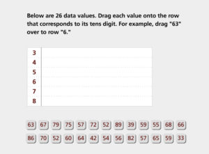
Instructions: Create a stem and leaf plot from a set of data collected from 26 people who guessed how long a minute is:
1. Place each value onto the row the corresponds to its ten digit. For example, drag “63” over to row “6.”
2. Place all 26 values to finish the plot.
In This Part: Ordering a Stem and Leaf Plot
If we work through the entire data set, our initial stem and leaf plot looks like this:

The final step in creating a stem and leaf plot is to order the data within each stem. For example, the first stem, 3, has two leaves, 9 and 3. To order this list of leaves, arrange them in order from 0 to 9. The first row becomes:
![]()
Problem A3
Use the following Activity to create an ordered stem and leaf plot on paper.
Instructions:
1. Put the data into numerical order by dragging each value onto its correct position within each row.
2. Place all 26 values.

In This Part: Interpreting the Stem and Leaf Plot
The ordered stem and leaf plot from Problem A3 looks like this:
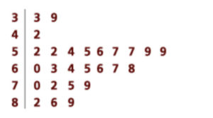

A stem and leaf plot shows us potential patterns in the responses that may not be apparent in the original listing of the data. For example, we can see that a large number of data values are in the 50s and 60s. Ordering a stem and leaf plot offers another way to represent the answers to our question, “How well do people judge when a minute has elapsed?”
Problem A4
Based on the ordered stem and leaf plot:
a. How many of the estimates are between 33 and 89 seconds (inclusive)?
b. How many of the estimates are between 52 and 68 seconds (inclusive)?
Problem A5
Since the goal is to estimate when a minute has elapsed, it makes sense to consider how close the estimates are to the correct response, which is 60 seconds.
a. How many people’s estimates were more than five seconds away from one minute? That is, how many of the responses were less than 55 seconds or greater than 65 seconds?
b. How many estimates were within five seconds of one minute?
c. How many estimates were more than 10 seconds away from one minute?
d. How many estimates were within 10 seconds of one minute?
Problem A6
a. Determine the mean of this data set. How does the mean compare to the correct response of 60 seconds?
b. How many people’s estimates were more than 5 seconds away from the mean?
c. How many people’s estimates were more than 10 seconds away from the mean?
d. Why is it not useful to calculate the mode for this data set?
![]() The mean can be found by adding all the data values and dividing by the total number of values in the set.
The mean can be found by adding all the data values and dividing by the total number of values in the set.
Asking and answering questions like the ones in Problems A5 and A6 can help us learn more about the variation present in a data set, they are important questions to consider as we interpret our data.
In This Part: Grouping by Fives
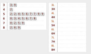
The stem and leaf plot for the 26 estimates of elapsed time illustrates a grouping of the data by tens; for example, the first stem contains all values from 30 to 39. A stem and leaf plot, however, does not have to group the data by tens — we could have grouped by fives, for instance. If we were grouping by fives, we would consider all possible numbers in the 50s, for instance, and then put them in two groups, the High and the Low:
![]()
When forming the stems for a grouping by fives, we consider the second digit of each number as well as the first:
- Numbers in the Low Group end with a second digit of 0, 1, 2, 3, or 4.
- Numbers in the High Group end with a second digit of 5, 6, 7, 8, or 9.
Note that the two groups each have the same number of possible second digits (5). When creating a stem and leaf plot, all stems should have the same number of possible leaves.
To classify our 26 responses in this way, we set up our stem and leaf plot with stems corresponding to the Highs (H) and Lows (L) and then group the responses accordingly. For example, the first data value (63) is on stem 6L since its leaf, 3, is in the Low Group:

Problem A7
Use the Activity below to convert the stem and leaf plot grouped by tens into a stem and leaf plot grouped by fives.
Instructions: Copy the chart on a piece of paper.
1. Separate each row in the stem and leaf plot into two rows: Low (digits 0-4) and High (digits 5-9). For example, place the “3” from row “3” to row “3 Low” and place the “9” in row “3 High.”
2. Place each of the 17 digits into its High or Low position, or click “See Completed” to complete the plot.
In This Part: Ordering Low and High
When the ordered stem and leaf plots for grouping by tens and grouping by fives are placed next to each other, you can see the connections between the two as well as some different patterns in the variation.

Each stem of the first stem and leaf plot corresponds to two stems in the second: one that represents the lower five digits in the leaves and one that represents the upper five. Increasing the number of stems (e.g., five units per stem rather than 10) allows you to see smaller degrees of variation between stems, but each stem will generally have fewer leaves. You must find the best compromise between stems that are too wide to differentiate between data and stems that are too narrow to see trends in the overall data.
You can choose different-sized groupings for the stem and leaf plots for different data sets (e.g., one can be grouped by fives and one can be grouped by 100s, if those are the groupings that will work best). In general, try to use no fewer than five and no more than 15 stems when constructing a stem and leaf plot.
Problem A8
Based on the stem and leaf plot grouped by fives, give two descriptive statements that provide an answer to the question “How well do people judge when a minute has elapsed?” Your answers should take into account the variation in the data.
Problem A9
- Think of a situation in which it would be useful to create a stem and leaf plot that would be grouped by a number larger than 10.
- Think of a situation in which a stem and leaf plot would be impractical or would not be an effective way to present your data.
Notes for Session 3
Note 1
Data are provided for this activity; however, if you collected your own data in Session 1, you can use that data instead. Keep in mind the nature of this data — it is quantitative. Any positive number could be a measurement of time, although you can choose to round your data to the nearest second, as we’ve done with the provided data.
Note 2
As you create the stem and leaf plot, notice that this organization of the data is based on grouping by tens. Think about how patterns that appear in the stem and leaf plot would not appear in a line plot.
Solutions
Problem A1
The range of data values is from 33 to 89, which is probably too wide for a line plot to be useful. Furthermore, there is so much variation to the data that a line plot probably would not indicate any clear trends.
Problem A2
The initial construction of the stem and leaf plot looks like this:

Problem A3
The ordered stem and leaf plot looks like this:

Problem A4
a. All 26 estimates are between 33 and 89 seconds, as the ordered stem and leaf plot indicates.
b. Sixteen of the 26 estimates are between 52 and 68 seconds. Nine are between 52 and 59 seconds, and seven are between 60 and 68 seconds.
Problem A5
a. There are six estimates below 55 seconds and 10 estimates above 65 seconds. In total, 16 of the 26 estimates were more than five seconds away from one minute.
b. Since 16 estimates were more than five seconds away from one minute, the remaining 10 of 26 estimates were within five seconds of one minute.
c. Three estimates were below 50 seconds, and six were above 70 seconds. In total, nine of 26 estimates were more than 10 seconds away from one minute.
d. Since nine estimates were more than 10 seconds away from one minute, the remaining 17 of 26 estimates were within 10 seconds of one minute.
Problem A6
a. The mean is about 62.35, which is found by adding up all the data values and dividing by 26, the number of values in the set. (1,621 / 26 = 62.35). The mean is fairly close to 60 seconds, although we might predict that most people tend to overestimate when 60 seconds have elapsed, based on these 26 observations.
b. As the mean is 62.35, there are eight estimates above 67.35 and 10 estimates below 57.35. In total, 18 of 26 estimates are more than five seconds away from the mean.
c. There are five estimates above 72.35 and five estimates below 52.35. In total, 10 of 26 estimates are more than 10 seconds away from the mean.
d. There is so much variability that the mode does not carry much information. In reality, it is extremely unlikely for two people to come up with exactly identical times for their estimates, since time is a continuous variable.
Problem A8
There are many descriptive statements that could provide an answer to this question. Here are some things you may have noted in your descriptions:
- All estimates are between 33 seconds and 89 seconds. The range is 56 seconds, which indicates a lot of variation in the estimates.
- There is a concentration of estimates between 52 seconds and 68 seconds. Sixteen of the 26 estimates (or 16 / 26 = 61.5%) fall within this interval. Note that the range of this interval is only 16 seconds.
- Only two different values (57 and 59) occur more than once. There is no one value that occurs most frequently.
- The most common response time is in the range of 55 to 59 seconds, a range that contains six (23%) of the 26 estimates.
- Poor estimates are more likely to be overestimates than underestimates. Only three estimates were 50 or below, while seven estimates were 70 or higher.
Problem A9
a. A stem and leaf plot of the salaries of people working at a company or the populations of towns in a state would need wider groupings.
b. Stem and leaf plots cannot be used for qualitative data, such as gender or car color. A stem and leaf plot may not be very effective when there are few data points or when the data values are close together.